🧩 Building Responsive Layouts with CSS Grid
CSS Grid is a powerful layout system that makes it easy to build complex, responsive designs. With just a few lines of CSS, you can create grids that adapt to any screen size.
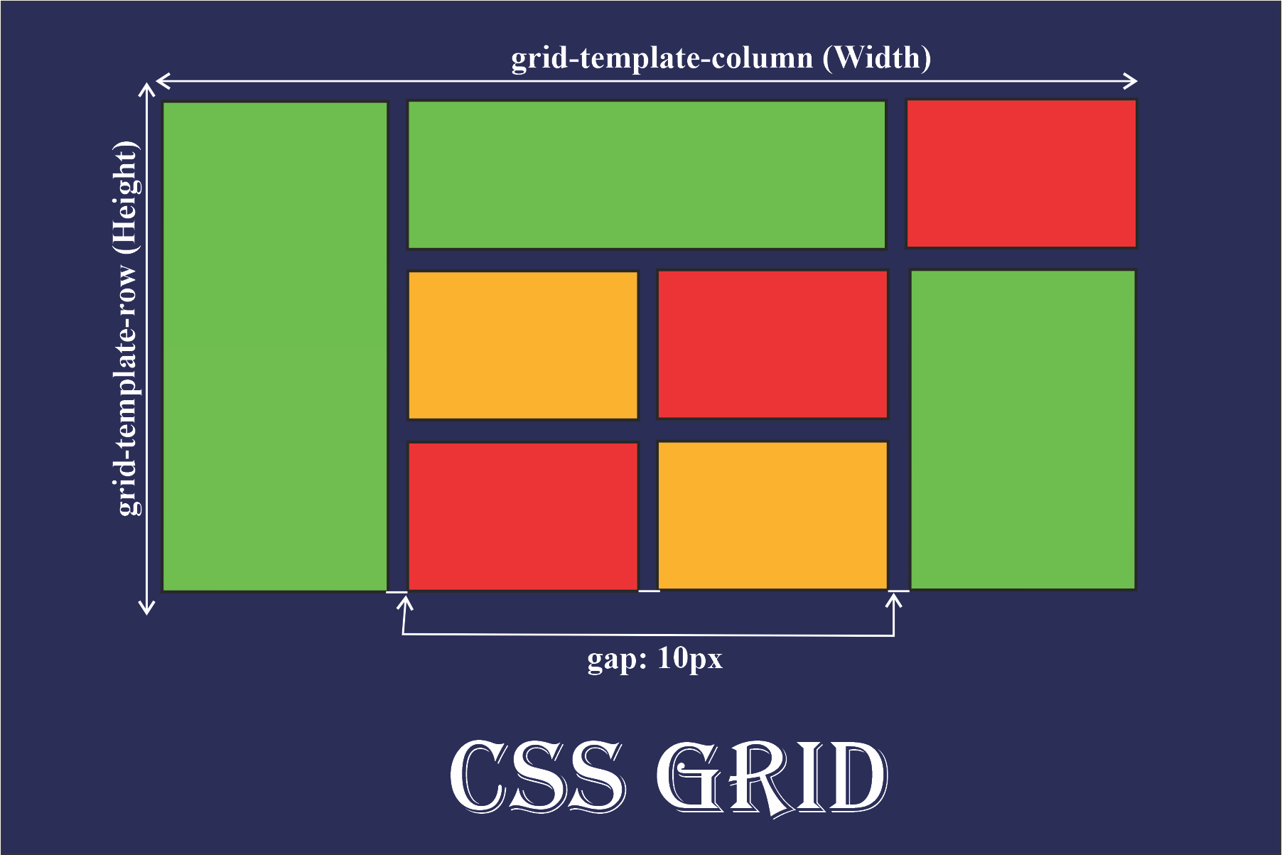
Grid allows you to define rows and columns, place items exactly where you want, and even create overlapping elements. Combined with media queries, CSS Grid is perfect for building layouts that look great on desktops, tablets, and phones.
Start using CSS Grid today to simplify your layout code and deliver a better user experience!